Fixed-width CSS Layouts
The fixed-width (or fluid, as it is sometimes known) CSS layouts in this section of the site are all original code provided by Adam Senour and Search Engine Friendly Layouts. All of the XHTML, CSS, and Javascript code (if applicable) contained within may be reused free of charge. There are fixed-width layouts in both 2-column and 3-column styles.
The graphic associated with each layout at the top indicates the ordering of the elements within said layout.
To use the layouts provided on this site, simply select the appropriate sections of code provided in the grey boxes containing the XHTML, CSS, and Javascript associated with each layout, and then copy and paste into your favourite text-based editor.
If you do not have a text-based editor, I highly recommend Notepad ++. Notepad ++ works in a very similar fashion to Windows Notepad, except that it colour-codes the appropriate XHTML, CSS, and Javascript and thus makes it much easier to read and debug.
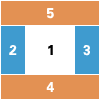 3 Column Fixed-Width Layout, Header, Footer
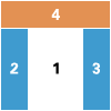 3 Column Fixed-Width Layout, Header, No Footer
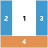 3 Column Fixed-Width Layout, No Header, Footer
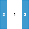 3 Column Fixed-Width Layout, No Header, No Footer
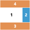 2 Column Fixed Width Layout, Right Side Menu, Header, Footer
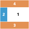 2 Column Fixed Width Layout, Left Side Menu, Header, Footer
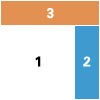 2 Column Fixed Width Layout, Right Side Menu, Header, No Footer
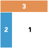 2 Column Fixed Width Layout, Left Side Menu, Header, No Footer